
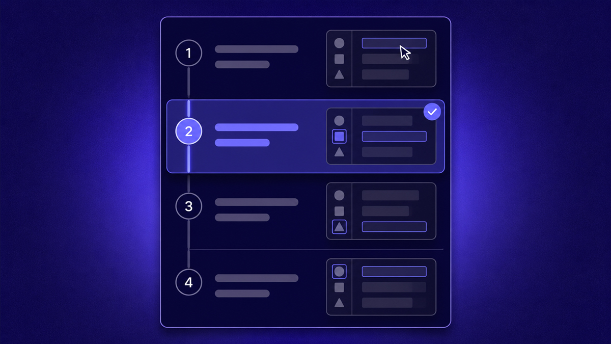
Knowing how to write step-by-step instructions comes down to respecting one constraint: your reader holds exactly what is on their screen and nothing else. Good instructions therefore start from the reader's actual starting state, issue one action per step, name every button exactly as labeled, show what success looks like after each action, and pre-answer the ways things go wrong. This guide turns those principles into concrete rules you can apply to any software procedure today.
What makes instructions genuinely easy to follow?
Easy instructions share four properties: the reader's starting state is stated up front, each step contains exactly one action, every UI element is called by its exact on-screen name, and each step confirms what the reader should now see. Remove any one of them and readers start guessing, and a reader who guesses accumulates small errors until the procedure fails somewhere you cannot see.
Notice what is absent from that list: thoroughness. Comprehensive instructions that bury single actions inside paragraph-shaped steps are harder to follow than lean ones, because working memory is the bottleneck. Every extra clause competes with the click the reader is about to make. Write for the moment of execution, someone standing at the screen with one hand on the mouse, not for someone reading in an armchair.
Where should the reader start?
Start every instruction set with an explicit precondition line: which account role or permission is required, which screen the reader begins on, and what prior knowledge you assume. Readers abandon instructions at step three when step zero was wrong for them, because they were in the wrong workspace, lacked admin rights, or had never created the record the procedure edits. One sentence up front filters the audience honestly:
- Name the role: You need administrator access to the workspace.
- Name the location: Start from the project dashboard, not inside an individual report.
- Name the assumed knowledge: This assumes you have already connected the data source (link to that guide).
- Name the time or state: Takes about five minutes; changes apply to everyone immediately.
If different starting states genuinely exist, such as new account versus legacy plan or mobile versus desktop, write separate variants rather than branching inline. Inline branches multiply faster than writers expect and are the leading cause of steps that say if you see X skip ahead, which readers reliably misread.
Why one action per step, and what counts as one action?
One action per step works because readers execute while reading; a step holding two actions gets half-followed. The test is simple: if a step contains then, split it. Open Settings and click Billing is two steps, Open Settings followed by Click Billing, because between those clicks lives a screen the reader must recognize before proceeding.
What counts as one action is one decision or one manipulation: a click, a typed value, a choice from a dropdown. Waiting is also an action (wait for the export to finish) because readers need permission to pause. And a step may legitimately include two sentences when the second confirms the result, since confirmation is not an action but feedback attached to the action above it.
How do you name buttons and screens so nobody gets lost?
Name UI elements exactly as the interface labels them, in bold, and chain paths with arrow notation: Settings › Billing › Plan. Never paraphrase. The billing area forces readers to hunt for a button you could have named, and paraphrases rot fastest when the interface changes. After each named control, say what happens next so readers confirm arrival before continuing:
- Verb first: Click Export, Type the invoice number, Select Editor.
- Exact label in bold: Send invite, not the invite button.
- Path notation for depth: Settings › Members › Role.
- Result sentence after the action: The Members page opens with a list of current seats.
- Never write click here, the obvious option, or as usual, since none survive contact with a new reader.
The format itself, demonstrated
Rules are easier to trust when you see them working, so the procedure below demonstrates its own advice: imperative titles, one action per step, bolded exact labels, a stated result, and a failure branch the moment something can go wrong. It documents inviting a teammate to a workspace, so follow it literally and you will both learn the format and finish the task:
- 1
Open workspace settings
Click Settings in the left sidebar, then choose Workspace from the top tab row. The General panel opens. If you do not see Settings, your account lacks admin rights, so stop here and ask a workspace administrator to complete these steps or elevate your role.
- 2
Start the invite
Click Invite people in the upper-right corner of the Members panel. A dialog opens with a single email field. If the button reads Manage seats instead, your workspace has no seats left, so see Adding seats in the linked billing guide before continuing.
- 3
Enter the teammate's email
Type their work email into the email field and press Send invite. The dialog closes and the person appears in the member list flagged Pending. If you see email already in use, they hold an existing seat under another address, so search the member list for their name before creating a duplicate.
- 4
Set their role
Open the Role dropdown on the pending row and select Editor for teammates who create content, or Viewer for read-only access. The change applies immediately; there is no save button to find.
- 5
Confirm acceptance
Ask the teammate to accept the email invitation. Their status flips from Pending to Active within moments of accepting. If the status still shows Pending after a day, open the More options menu on their row and choose Resend invite, since corporate spam filters swallow invitation mail more often than any other cause.
Screenshots, GIFs, or video: what belongs where?
Use a screenshot at every state change, since each new screen, dialog, or confirmation deserves one, and reserve motion formats for gestures that still images cannot show. Static images scan instantly, print cleanly, translate easily, and stay cheap to update; motion earns its cost only when timing or drag matters. Placement rules that hold across formats:
- Capture the moment after the click lands, so the screenshot shows the result the step promises.
- Crop to the relevant region, because full-screen captures bury the five pixels that matter.
- Annotate sparingly: one arrow or highlight box per image beats a circus of numbered callouts.
- Keep dimensions consistent across the whole document so nothing reflows jarringly.
- Choose GIFs or short clips for drags, hover-dependent menus, and anything where timing changes the outcome.
- Embed a full walkthrough video beside the written steps for readers who prefer watching once and doing from text.
That last pairing, one capture feeding both formats, is cheaper than producing them separately. Tools like stepvideo generate the edited video and an editable written guide, screenshots extracted automatically, from a single recording of the workflow, which keeps every visual honest against the live interface. The recording side of that pairing follows the same preparation discipline described in our guide to making a tutorial video.
How do you write the failure paths?
Write a failure path immediately beneath every step where something commonly goes wrong, phrased as If you see X, do Y. Brainstorm failures per step in three families: permissions (you lack rights to…), empty states (no data appears yet…), and waits (this takes up to a minute…). Quote actual error text verbatim inside quotation marks so readers who paste the message into search land on your document instead of a forum thread.
Failure paths are also where tribal knowledge hides. Ask the person who performs the task daily what breaks most often. Their answer, usually delivered as an aside (oh, sometimes it just spins, refresh twice), is the difference between instructions that work in production and instructions that work in demos.
A pre-flight checklist for any set of instructions
Before publishing, run the draft through gates that catch the failures reviewers otherwise miss in skim mode:
- Every step begins with a verb and contains no more than one action.
- Every UI reference matches the on-screen label exactly and is bolded.
- Each precondition (role, location, assumed knowledge) is stated before step one.
- Every state change has a visual within one step of the action.
- Steps prone to failure carry an if-then recovery line quoting real error text.
- A colleague who has never done the task completed it using only this document, silently observed.
- The document carries an owner, a date, and the product version or environment it was verified against.
Keeping instructions alive when the interface keeps changing
Instructions decay through drift, not through argument: the button moves, the doc says otherwise, trust erodes. Fight drift structurally rather than heroically. Assign a named owner, trigger reviews off release notes and support tickets, and prefer tools that make updates mechanical. When the written guide derives from a recorded take, as described in our guide to documenting a process, fixing a step re-renders both the text and the video together, so they cannot disagree. House everything in one searchable place, a video knowledge base serving text and video side by side, and route readers from inside the product to it. When the instructions form a formal SOP, the free SOP template adds the owner, review date and revision history around them.
Frequently asked questions
Strong instructions are an act of empathy enforced by formatting: know exactly where the reader stands, move them one action at a time, name the world precisely, and pre-empt the stumbles. Apply the checklist to your next procedure, watch one newcomer attempt it, and revise at every hesitation point.
Frequently asked questions
How detailed should each step be?
Detailed enough that the newest legitimate reader succeeds without asking questions, and no more. Beginners need the confirmation sentence after each action (the Members panel opens); experienced users skim past it harmlessly. The common failure is the reverse, with experts writing compressed compound steps because the task feels trivial to them. Calibrate to the least experienced person you genuinely expect to follow the document unassisted.
Should I use screenshots or GIFs in instructions?
Default to screenshots: they load instantly, print well, translate easily, remain searchable, and update piecemeal. Add GIFs or short clips only where motion is the information, such as drags, hover-revealed menus, and timing-dependent gestures, since animated files cost more to produce, slow pages down, and must often be re-recorded wholesale when one detail changes. For the whole flow, an embedded video beside the steps serves watch-once learners best.
How do I version instructions when the software changes?
Put maintenance metadata in the document itself: a named owner, the date last verified, and the product version or environment tested against. Trigger reviews from release notes and recurring support tickets rather than hoping someone remembers. When visuals come from a recorded take via a tool like stepvideo, updating the affected steps and re-rendering regenerates both guide and video, which keeps versions honest without a full rewrite each release.
What tools help write step-by-step instructions?
Three categories cover most needs: a docs wiki for hosting and search, a screenshot annotator for callouts and arrows, and capture-to-guide tools that turn a recorded workflow into an editable written guide plus video. stepvideo works this way, generating steps and extracted screenshots from one Chrome recording. Choose based on how often procedures change: static docs suit stable processes, while capture-based pipelines pay for themselves under frequent UI churn.
How long should a step-by-step guide be?
As long as the task demands and not a sentence longer, measured in steps rather than words. Most software tasks fit in five to fifteen single-action steps; beyond roughly twenty, readers lose orientation and you should split the procedure into phases or separate guides linked in sequence. Length creep usually signals scope creep: if half the steps serve an optional variant, that variant deserves its own document.
How do I test whether my instructions actually work?
Hand the draft to someone who has never performed the task and watch silently, with no hints, no corrections, and no finishing their clicks. Every hesitation, back-scroll, or wrong turn marks a defect even if they eventually recover, because future readers will hesitate identically. Revise at each marked spot and repeat with a fresh tester until the run completes without pauses. One clean silent run predicts real-world success better than any amount of author self-review.